What’s The Difference Between the Sizing Options PX, EM, and REM?
- Edy Werder
- Published on:
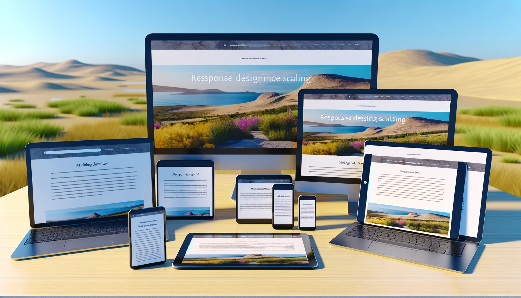
Understanding the difference between PX, EM, and REM sizing options in web design, particularly in WordPress themes and custom CSS, is crucial for ensuring your website looks great on all devices. These units are used to define font sizes, layout dimensions, and more, playing a significant role in the responsiveness and accessibility of a website.
PX (Pixels)
- Definition: Pixels are the smallest unit of measurement on a screen. PX values are fixed and don't change based on the parent element's size or the user's display settings.
- Use Cases: Pixels are great for when you need precise control over element sizes, such as images, or when designing for specific screen sizes. However, they need to be more flexible when building responsive designs that adapt to various screen sizes and user settings.
EM
- Definition: The EM is a scalable unit used in web document fonts. The size of 1 EM is dynamic and changes based on the parent element's font size.
- Use Cases: EMs help create scalable layouts and typography that adjust based on the user's settings or the parent element's font size. It can be convenient in responsive design, allowing elements to scale up or down along with the text. However, because EMs are relative to the parent element, managing sizes can become complex in nested elements, leading to unexpected results if not carefully managed.
REM (Root EM)
- Definition: REM units are similar to EMs but are always relative to the root (HTML) element's font size rather than the parent element's. It makes REMs more predictable and easier to manage than EMs.
- Use Cases: REMs are ideal for responsive typography and spacing throughout a website. Since REMs are based on the root font size, changing the font size on the html element will scale up or down all elements sized with REMs, making it easier to achieve a consistent and scalable design.
- For most page builders, 1 REM equals 16px.
Edy's Recommendation
For a responsive and accessible design, using REM units for font sizes and most spacing (margins, paddings) is highly recommended. REMs balance flexibility and control, allowing you to quickly scale your design based on the user's preferences and the display characteristics. Here are a few recommendations:
- Use REMs for Fonts: This ensures your typography scales nicely across different devices and respects the user's accessibility settings.
- Fallback with Pixels: Consider providing a pixel fallback for older browsers that might not support REMs.
- Consistent Scaling: Utilize a base font size on the HTML element and scale your design using REMs for a consistent and accessible user experience.
- Media Queries: Use REMs in your media queries to maintain consistency in your responsive design.
By understanding and appropriately applying PX, EM, and REM units, you can create more responsive, accessible, and user-friendly WordPress sites.
